TfL Bikes Hired

With the society becoming more and more aware of what is affecting the environment, many individuals are shifting to bike usage as compared to cars. With this project, we want to analyse what could be the factors that affect increase or decrease in bike rentals in London.
Let’s have a look at the data
skimr::skim(bike0)| Name | bike0 |
| Number of rows | 4416 |
| Number of columns | 2 |
| _______________________ | |
| Column type frequency: | |
| numeric | 1 |
| POSIXct | 1 |
| ________________________ | |
| Group variables | None |
Variable type: numeric
| skim_variable | n_missing | complete_rate | mean | sd | p0 | p25 | p50 | p75 | p100 | hist |
|---|---|---|---|---|---|---|---|---|---|---|
| Number of Bicycle Hires | 0 | 1 | 26844 | 9900 | 2764 | 19698 | 26607 | 34206 | 73094 | ▃▇▅▁▁ |
Variable type: POSIXct
| skim_variable | n_missing | complete_rate | min | max | median | n_unique |
|---|---|---|---|---|---|---|
| Day | 0 | 1 | 2010-07-30 | 2022-08-31 | 2016-08-14 12:00:00 | 4416 |
First, we need to clean the data to make it easier to perform data visualisation on it.
# change dates to get year, month, and week
bike <- bike0 %>%
  clean_names() %>%
  rename (bikes_hired = number_of_bicycle_hires) %>%
  mutate (year = year(day),
          month = lubridate::month(day, label = TRUE),
          week = isoweek(day))
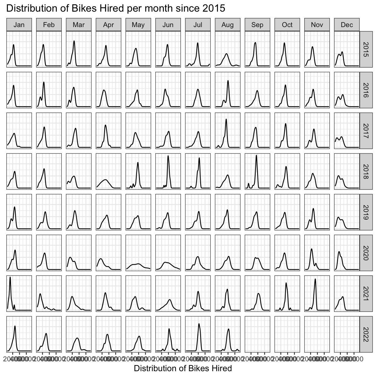
How many bikes were hired per month and year since 2015?
We plot a density plot to find out the distribution of the bikes per month since 2015.
Next, we try to find the difference in expected and actual bikes hired in London between 2017-2022. Here, we have calculated expected based on the monthly averages between 2016-2019.
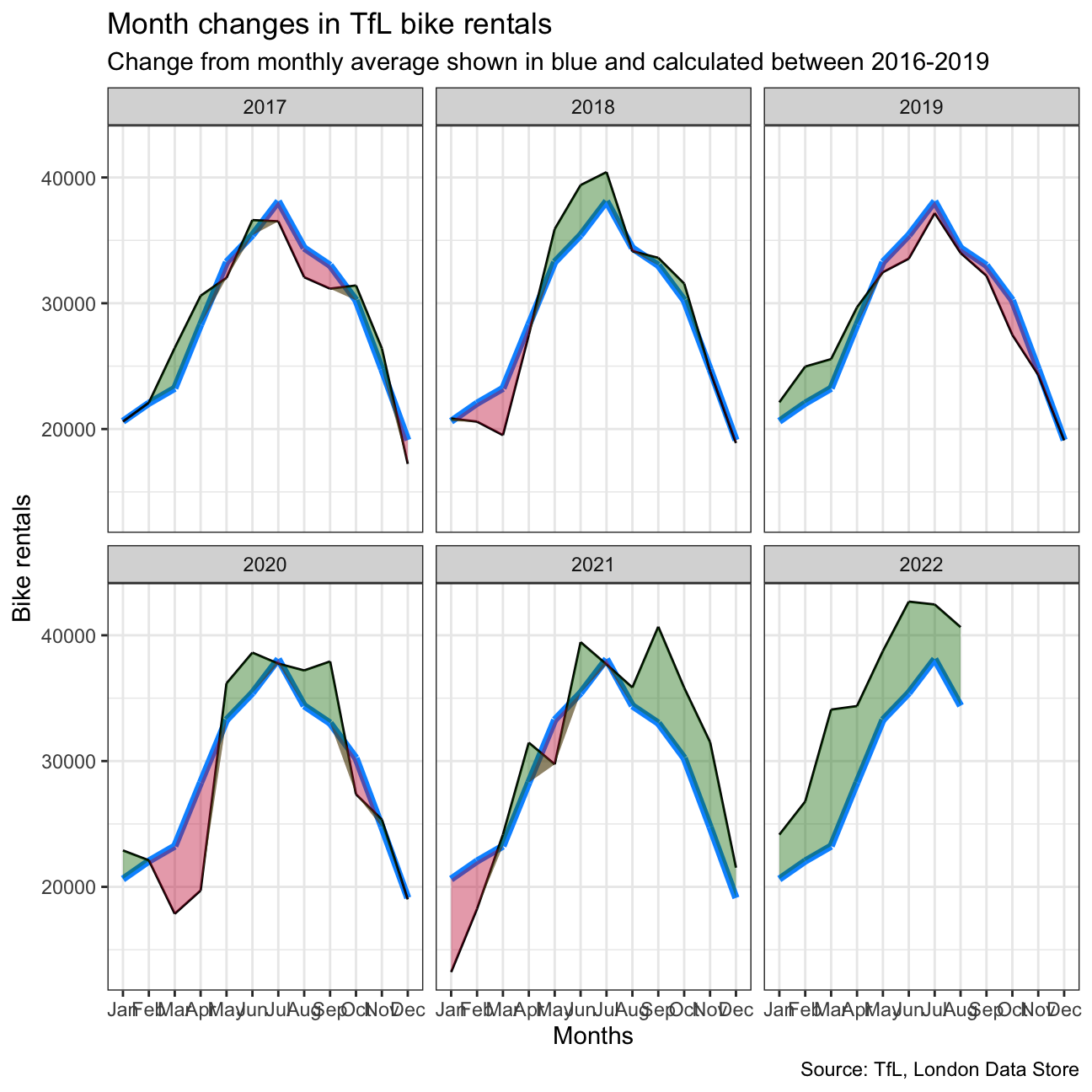
One important thing to note in this graph is that since, 2016-2019 average values are included in calculating the expected bikes hired, the line for the actual bikes hired does not vary too much from the expected. But, for 2020 to 2022, we can clearly observe a lot more variations.
Now, we do the same thing but keeping in mind the weekly averages of bikes hired.
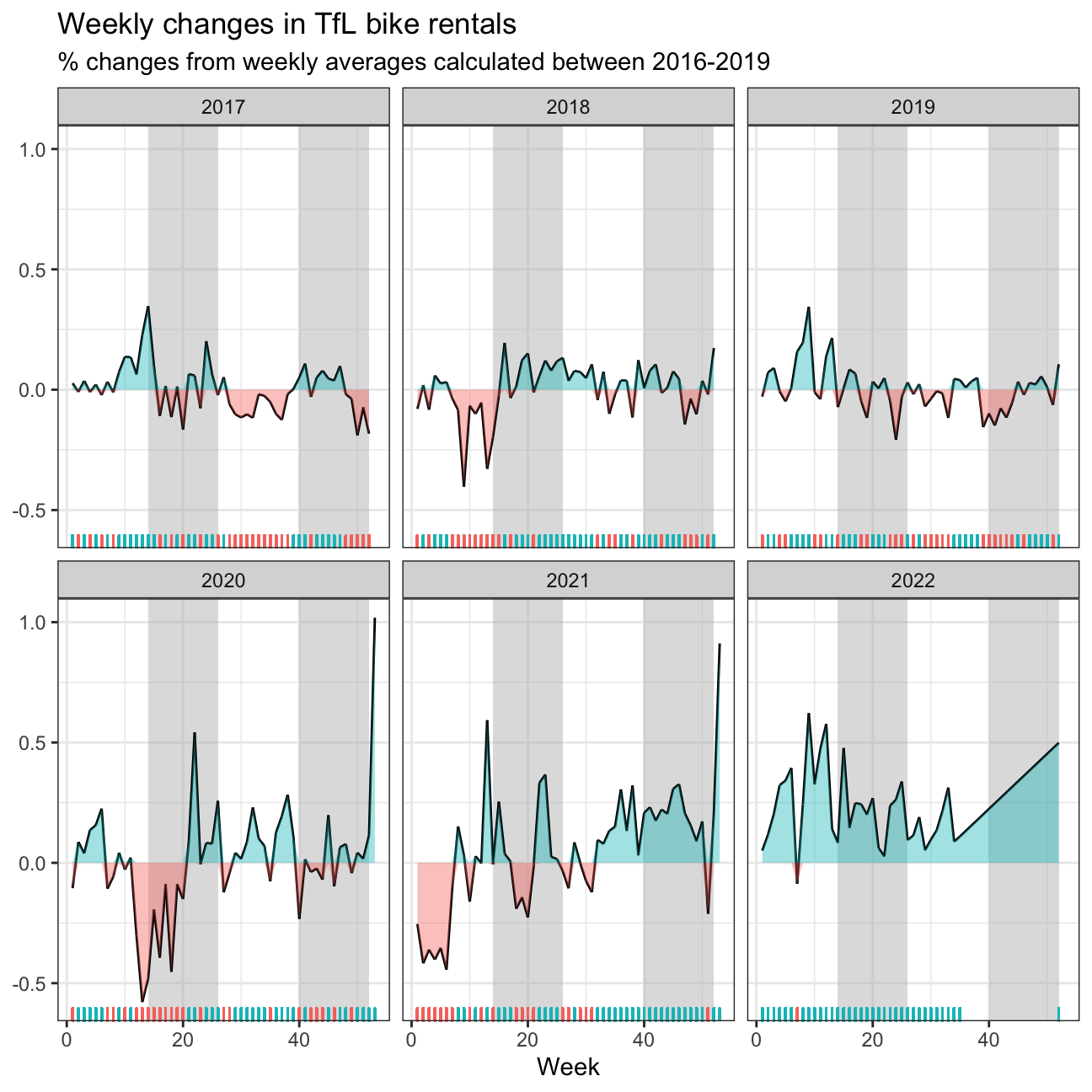
We decided to use mean, because the data showed seasonal trends and there were not many clear outliers, which would affect the data.